Lifestyle
Serafi
- Project
- Serafi
- Services
- Brand identity, packaging, digital, signage
- Year
- 2023
The brief
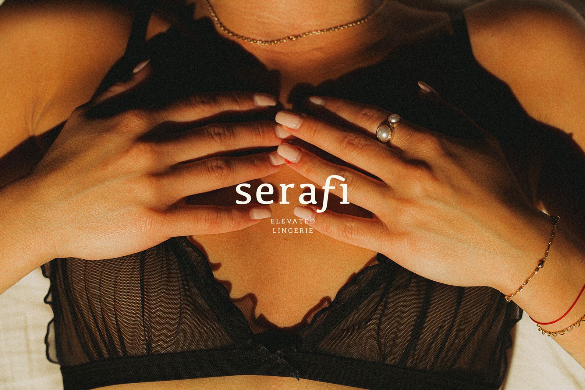
Lingerie branding often falls into familiar territory: overtly sensual or deliberately understated. Both tend to be designed around being seen. Serafi asks what confidence looks like when it isn't performing for anyone.
Meaning ‘fiery ones’, the name became the starting point for a brand designed to ignite confidence from within.
Outcome
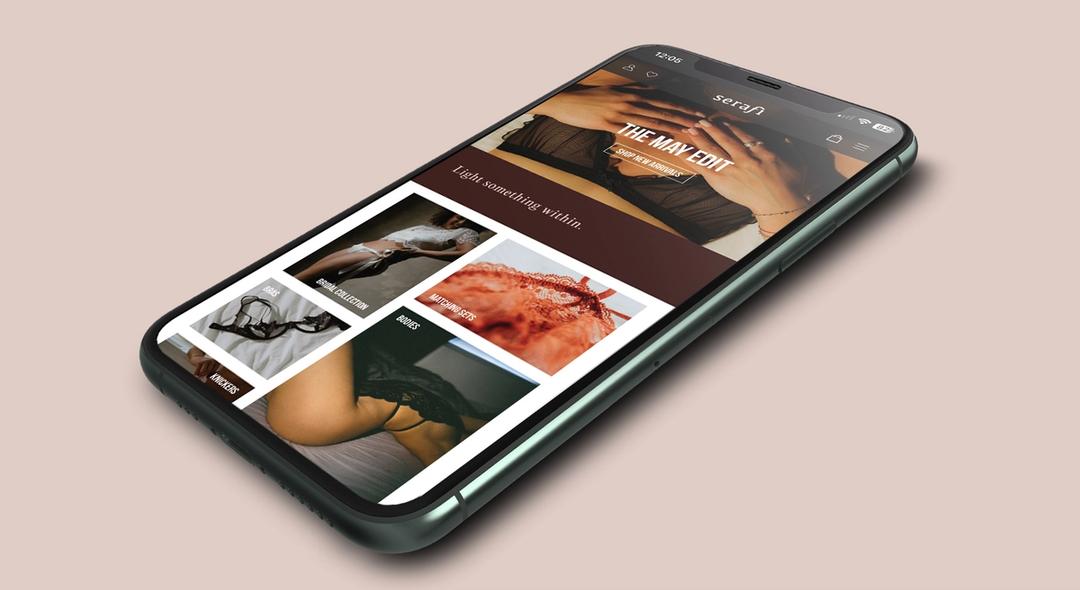
The typography shifts according to who is being spoken to: a soft serif for the woman wearing it, and a condensed sans for the woman buying it.
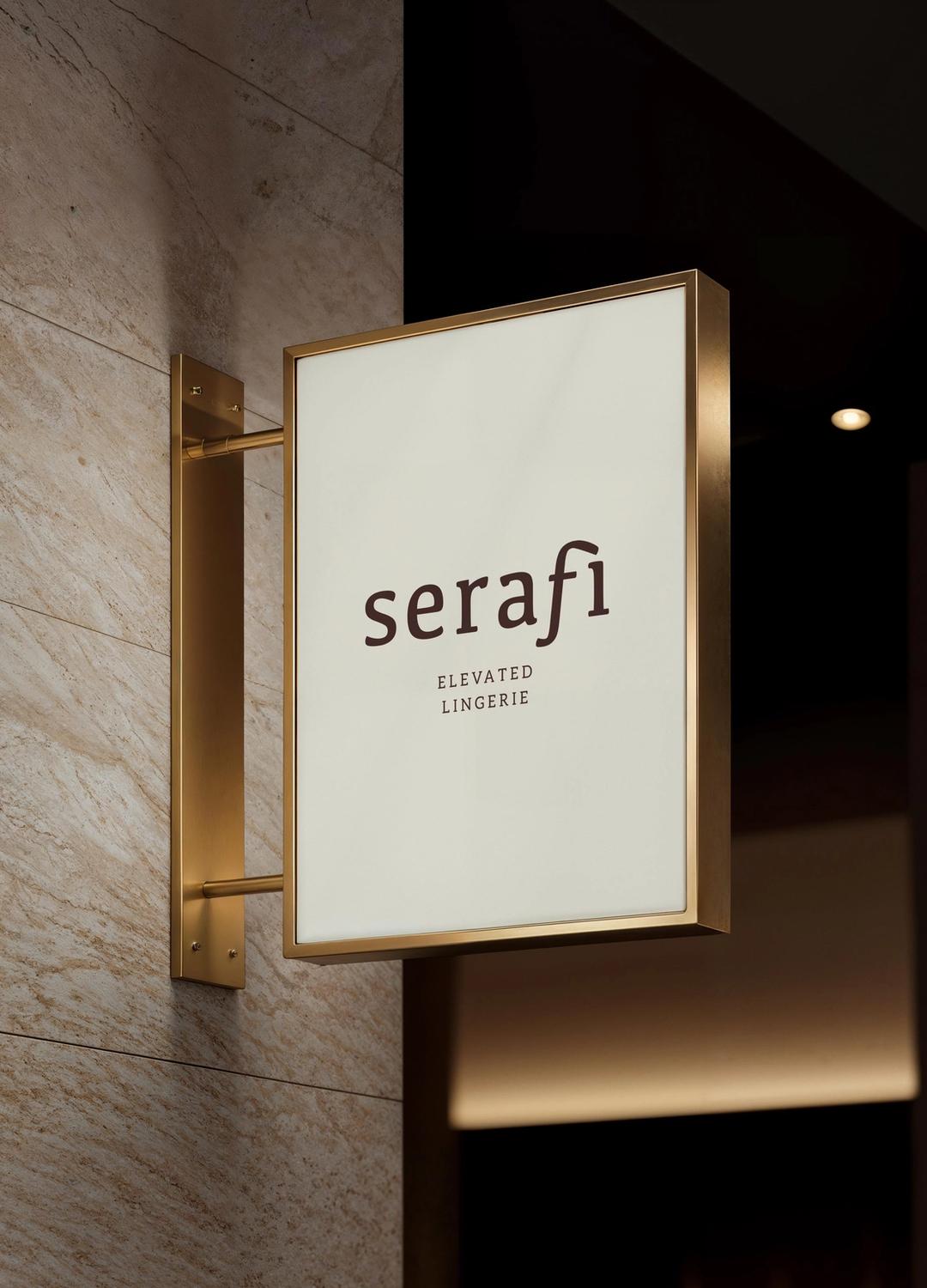
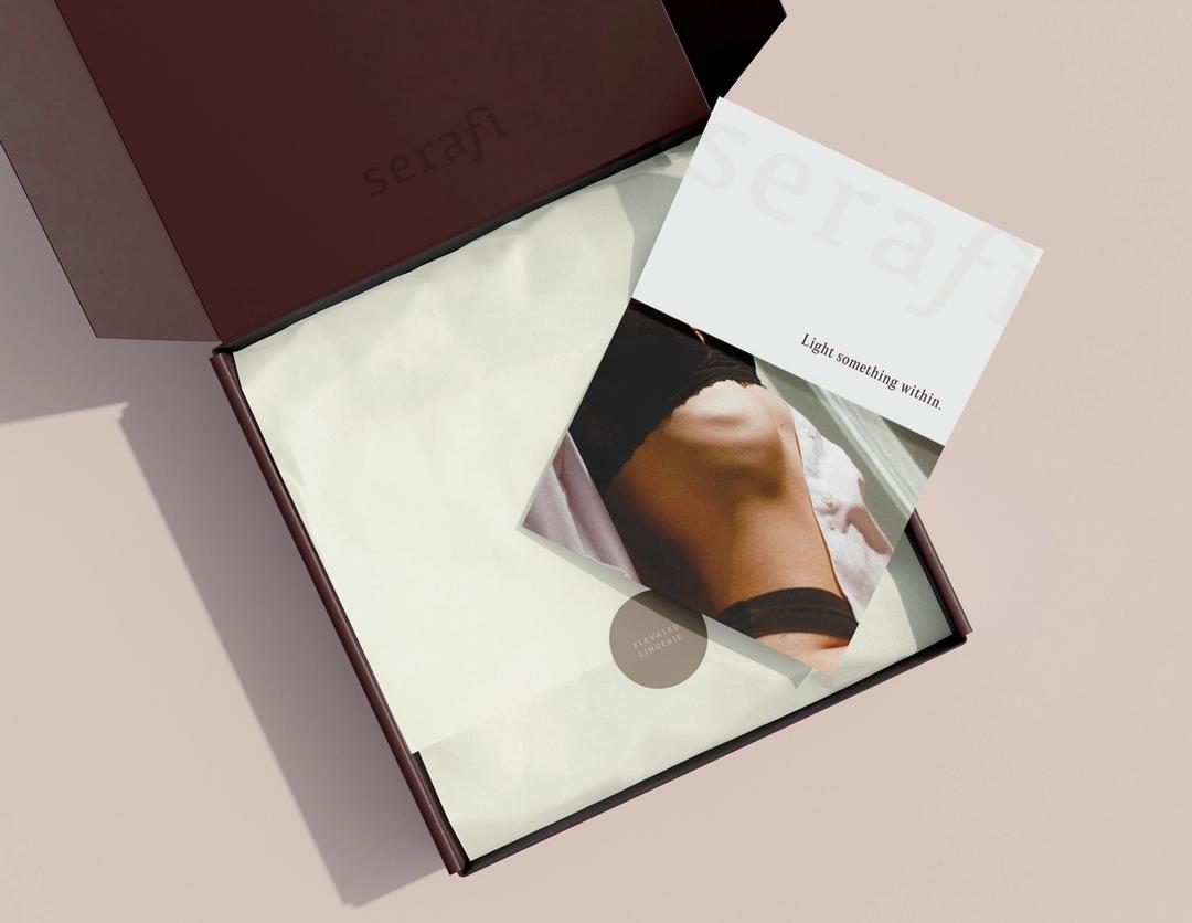
Warm creams and deep burgundy carry both voices across packaging, digital and signage, allowing the identity to shift in tone without changing character.